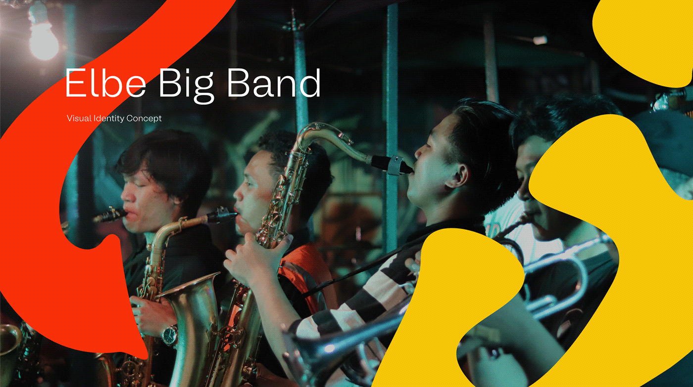
Elbe Big Band
Elbe Big Band is a Talent Interest Unit (UMB) under the auspices of the Music Arts Education Student Association and the Music Arts Education Study Program, Faculty of Art and Design Education, Indonesian University of Education. Elbe Big Band was founded in 2000 which was pioneered by several students, alumni, and also staff in the Music Arts Education Study Program. The word "Elbe" itself stands for Overtime Bitung, which is a building where lectures are held for the Sendratasik major (Art, Drama, Dance, and Music) which is located east of the UPI Gymnasium.
Challenge
This is a logo redesign project from the previous Elbe Big Band Logo. Elbe Big Band asked me to make their logo look fresher and simpler. Of course this is quite a challenge for me in compiling a visual identity with various meanings to become a symbol that can represent the ideas, ideas & spirit of the Elbe Big Band itself without losing the uniqueness of the previous logo. But here I am trying to apply a flat design style with indented letters that are not too stiff so that the logo looks fresher, simpler and up-to-date.
My Role : Creative Director & Designer


Concept Logos
The new logo from Elbe Big Band is made simple with the Wordmark Logo type, which is a logo composed using writing. This type of logo is used so that the logo is easy to remember, recognize, and apply to digital and print media needs.
With the main object being an inscription that reads Elbe taken from the brand name itself. This series of writings is made in a psychedelic style so that the writing doesn't look stiff. In addition to adding uniqueness, we shape this paper to resemble a saxophone object which is one of the dominant wind instruments played in the Elbe Big Band. In this Elbe article, we apply elements from wind instruments such as the Bell (part of the Saxophone organology) contained in the letters E & L in the logo. These elements are applied to make this logo look consistent with the same style from the main object to the details. This concept illustrates the integration of all Elbe Big Band parties, starting from the chairman, structure, to members in building and carrying out management from year to year.
The colorful theme was applied to evoke new enthusiasm for Elbe Big Band's media branding and new enthusiasm in the process


